VendGo
VendGo is a local vendor app prototype designed to help users discover nearby shops, pop-up markets, and events while giving vendors a dedicated space to reach their community. The design process took us from research and persona development all the way through to a high-fidelity prototype, including a round of usability testing that shaped the final version. This was a school project built as a team of four.
the vendors worth finding don't show up on Google
Local markets, pop-up shops, and craft vendors are some of the most interesting parts of a city, and they're basically invisible online. Yelp and Google Maps are built for brick-and-mortar businesses with fixed addresses. If you want to find your favorite food truck or that jewelry vendor from last month's market, your best bet is a friend who already knew about them.
We wanted to change that which is how this whole app idea started for our project. The goal was to build something that actually served both sides of this community: shoppers looking for local finds and vendors trying to reach them.
getting to know the problem firsthand
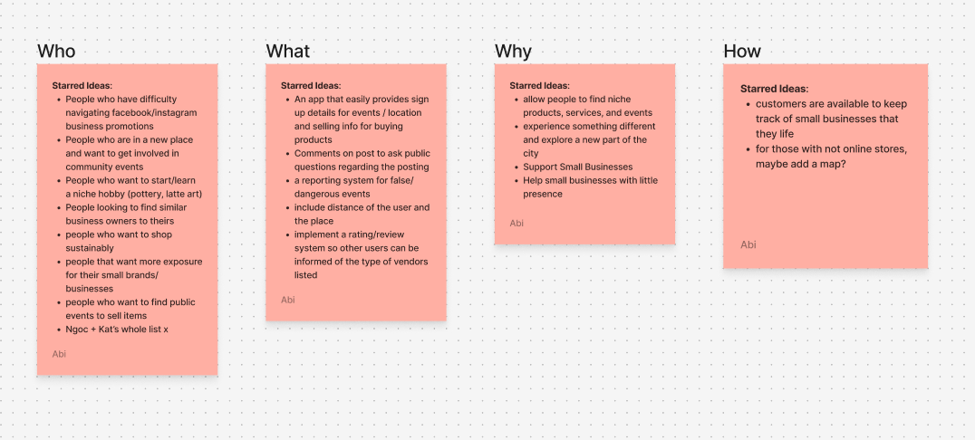
Before opening Figma, we ran interviews and surveys with fellow classmates to build a real picture of how people discover local vendors and what was getting in the way. We wanted to understand the who, what, why, and how of our target audience: who was actually looking for local vendors, what they were trying to do, why current tools kept falling short, and how they go about finding local businesses today.
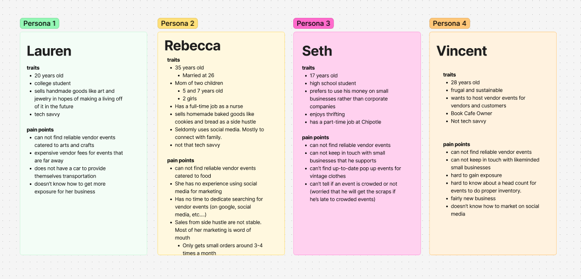
From those conversations, we built user personas to give our findings a face and a story. Creating specific personas helped us stay anchored to real people throughout the rest of the process rather than designing for abstract assumptions. We also mapped out recurring pain points from the research, from algorithm-buried social posts to having to check multiple platforms just to find out if a market was even open that weekend. Those pain points became the foundation for every feature decision we made going forward.
- Interviews and surveys with classmates revealed that word of mouth was still the dominant way people heard about local vendors, not apps or search engines
- User personas helped us address the needs of both shoppers browsing for local finds and vendors trying to build a consistent audience outside of social media
- Pain point mapping surfaced recurring frustrations: fragmented discovery across platforms, unpredictable social reach for vendors, and no single place to track local events
brainstorming: getting everything out of our heads
Before anyone started sketching, we ran a full brainstorming session in FigJam. We mapped out user needs, feature ideas, and pain points all at once without filtering anything yet. This session is where we landed on the core features we knew the app had to have: vendor discovery, a filter system, vendor profiles, and accessibility options like dark mode.
Having everyone contribute to the same board early on meant we were aligned on direction before splitting into individual workstreams. It made the handoff to lo-fi a lot smoother.
three things we kept coming back to
Discovery is luck, not design.
Nobody had a system for finding local vendors. People relied on friends, chance encounters, or checking five different apps. There was no intentional experience holding any of it together.
The motivation to buy local is already there.
We didn't need to convince anyone to support small vendors. People wanted to. They just needed a path from intention to action that didn't require that much effort.
This problem has two sides.
Any solution had to work for both shoppers and vendors. An app with a great discovery experience but incomplete vendor listings would fail from day one.
lo-fi wireframes: two rounds, one team
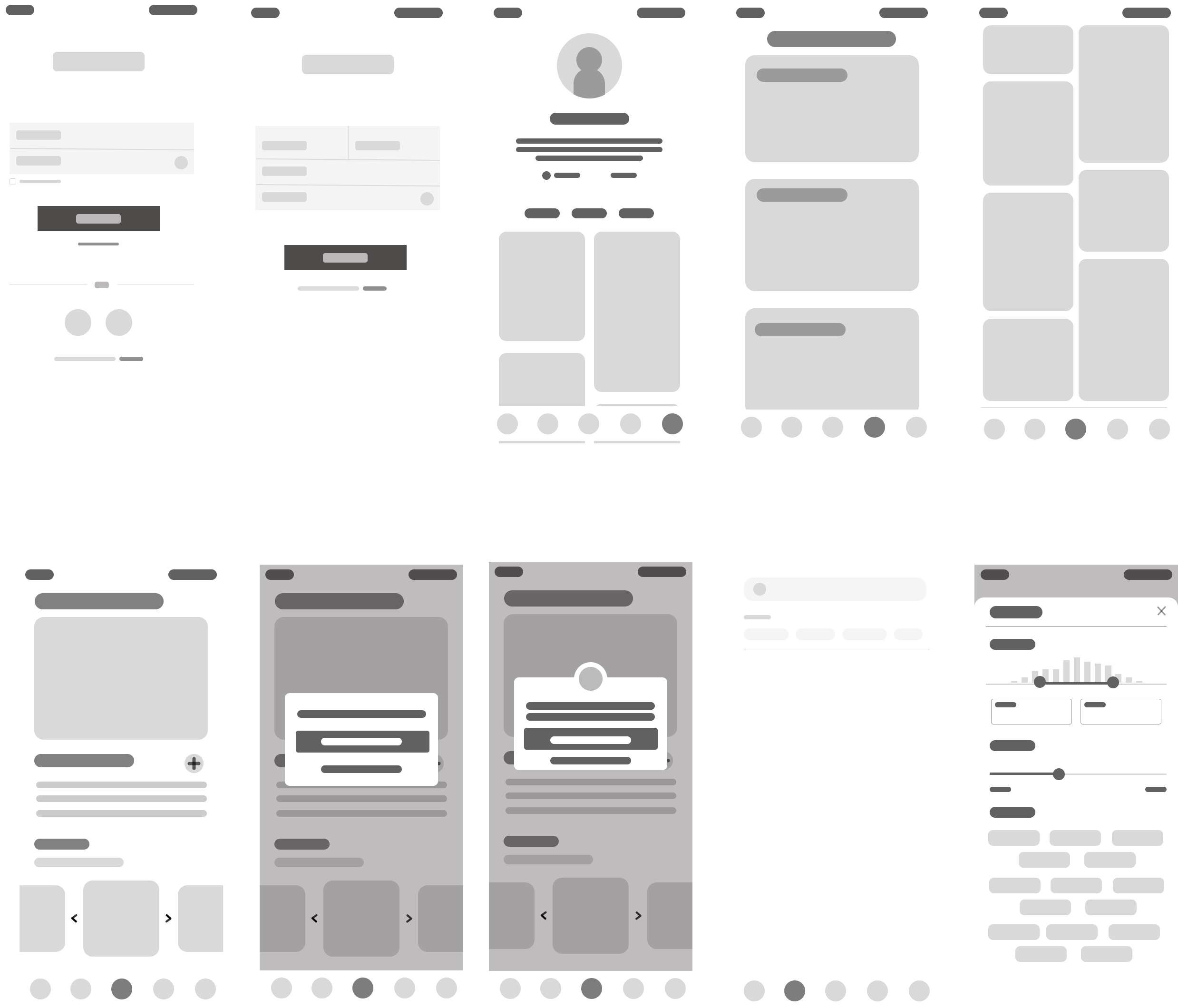
Once we had our feature list, each team member took ownership of a different section of the app and sketched lo-fi versions of what those flows could look like. Splitting up the features meant we could cover more ground quickly and bring different perspectives to the same problem before coming back together.
We went through two full rounds of low-fidelity wireframes. The first round was about getting ideas down and figuring out what was missing. The second incorporated feedback and refined layout and flow before we moved into high-fidelity. Each round was reviewed with real people, which led to some real structural changes before we ever touched color or type.
color and branding: setting the visual direction
Deciding on the visual identity was one of the more collaborative parts of the project. We chose a muted olive green as our primary color because local markets are outdoor, organic spaces. Green communicates freshness and community without the sterile feel of a tech-forward palette. A warm terracotta accent nods to the handmade, artisan character of the vendor scene. Together they felt authentic to the kind of people and places the app was built around.
We built out a shared component library in Figma to keep everything consistent as we worked in parallel. Every button, card, icon, and input state was defined and documented before we started applying them to screens. Having that system in place made it much easier to stay aligned as a team and move faster through the high-fidelity phase without second-guessing visual decisions.
high-fidelity: where it all came together
The high-fidelity prototype brought together everything we had learned across the lo-fi process, testing feedback, and branding work. Every screen was designed with a real user task in mind, and the visual polish came after the structure was solid.
dark mode: built in from the start
Dark mode wasn't an afterthought. We scoped it into the project early and treated it as an equally important version of the experience. We adjusted contrast ratios across every screen, tested text legibility in low-light conditions, and made sure our olive green and terracotta palette translated just as well on dark backgrounds as it did on light ones. Every interactive state, icon, and text level was reviewed to make sure the dark version held up the same way the light version did.
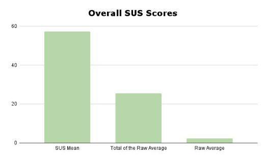
8 tasks, real feedback, honest results
Each participant was asked to navigate through our prototype and complete 8 tasks. We used the System Usability Scale to measure how intuitive the experience felt overall. The results pointed us toward clear areas to improve.
Tasks participants completed:
- Task 1: Sign up and make an account on VendGo
- Task 2: Like an event
- Task 3: RSVP for an event
- Task 4: Check an event host's profile
- Task 5: Check your own user profile
- Task 6: Check upcoming events
- Task 7: Find a vendor's products
- Task 8: Filter out searches
Plans for Improvement
Based on user suggestions and critique, we compiled a list of changes to address in our next iteration, as well as new features to explore:
Fixes
- Added back arrows on the vendor host page
- RSVP confirmation no longer redirects to the calendar page unexpectedly
- User icon now links directly to the user info page
- Sign-up text made darker for better visibility
- Added profile picture next to event host name
- Expanded the "forgot my password" flow
New Features
- Down arrow on search bar for better filter indication
- Events and products merged into a single "post" button for event host pages
- "Follow" button added to event host profiles
- Checkout page for in-app purchases
- Direct messaging page for buyer-seller communication
Takeaways From Testing
- Most tasks were completed with a 100% success rate, except "Check Your Profile" and "Check Upcoming Events"
- The app scored below average usability on the SUS, pointing to real structural issues we needed to address
- The User Profile and Event Host pages were hard for users to tell apart
- There was confusion between the Events Page, Upcoming Events Page, and the Calendar
- Certain text needed more contrast for readability
- Nav bar icons needed adjustment so users could tell when they were on or off a page
- Users wanted better tools to sort and filter information
- More buttons to confirm completion and return to previous pages were needed
designing all the way through: research to final product
VendGo was a school project, but it gave us a chance to go through the full design process as a team. Here's what I took away from it:
- Going through research, brainstorming, lo-fi, iterations, hi-fi, usability testing, and presenting to a final audience in one project gave me a real sense of how each phase connects to the next
- Usability testing changed how I think about design decisions. Reading your own work with a user in front of you is completely different from reviewing it yourself. The SUS results and task observations pushed us to make changes we wouldn't have caught on our own
- Keeping the user in mind at every stage, especially when implementing fixes after testing, meant we had to make decisions that weren't always the easiest or most visually exciting ones
- Working as part of a team on a shared Figma file and FigJam board helped me practice staying aligned and communicating design decisions clearly, not just making them
- This project was where I got real practice in prototyping, building component systems, and iterating based on structured feedback