ux research projects
Ethnote
Lead Researcher
Ethnote is a mobile-first tool that helps UX researchers capture and organize observations in real time without interrupting their workflow. It was designed to reduce the need to switch between paper notes and digital tools during fieldwork. As one of the lead researchers in the University of Houston UX Lab, I helped guide the project through research and testing.
We conducted remote usability testing with seven participants who had varying levels of experience with digital note-taking tools. Participants completed task-based scenarios while sharing their screens, and we observed their interactions and gathered feedback through follow-up questions. We also used SEQ scores to measure task difficulty and SUS scores to evaluate overall usability.
The results showed that while basic features like logging in and adding hashtags were easy to use, navigation was a major issue. Users struggled to find key features and move between sections. The average SUS score was 48.6, below the industry standard, and SEQ scores varied across tasks. Key problems included unclear navigation, confusing layout, and unclear labels, which guided improvements to make the app more intuitive.
"Great to hear from the UX team again and thank you so much for the report! Please thank the students for all of their hard work and patience completing the test and report! The team is excited (and a bit afraid) to dive further into your findings and see how we can improve EthNote on the UX front!
It really means a lot for a project like ours to get feedback from the outside so also a big thank you to you for coordinating everything and communicating with us. We might be doing a whole new platform in the fall/spring as we have realized it might be better to rethink the entire platform from scratch to realize our qualitative end-to-end platform-vision but for now we're sticking to get this platform to a place where we can properly launch it."
— Ethnote Team, in response to our research findingsResearch Methods
View Case Study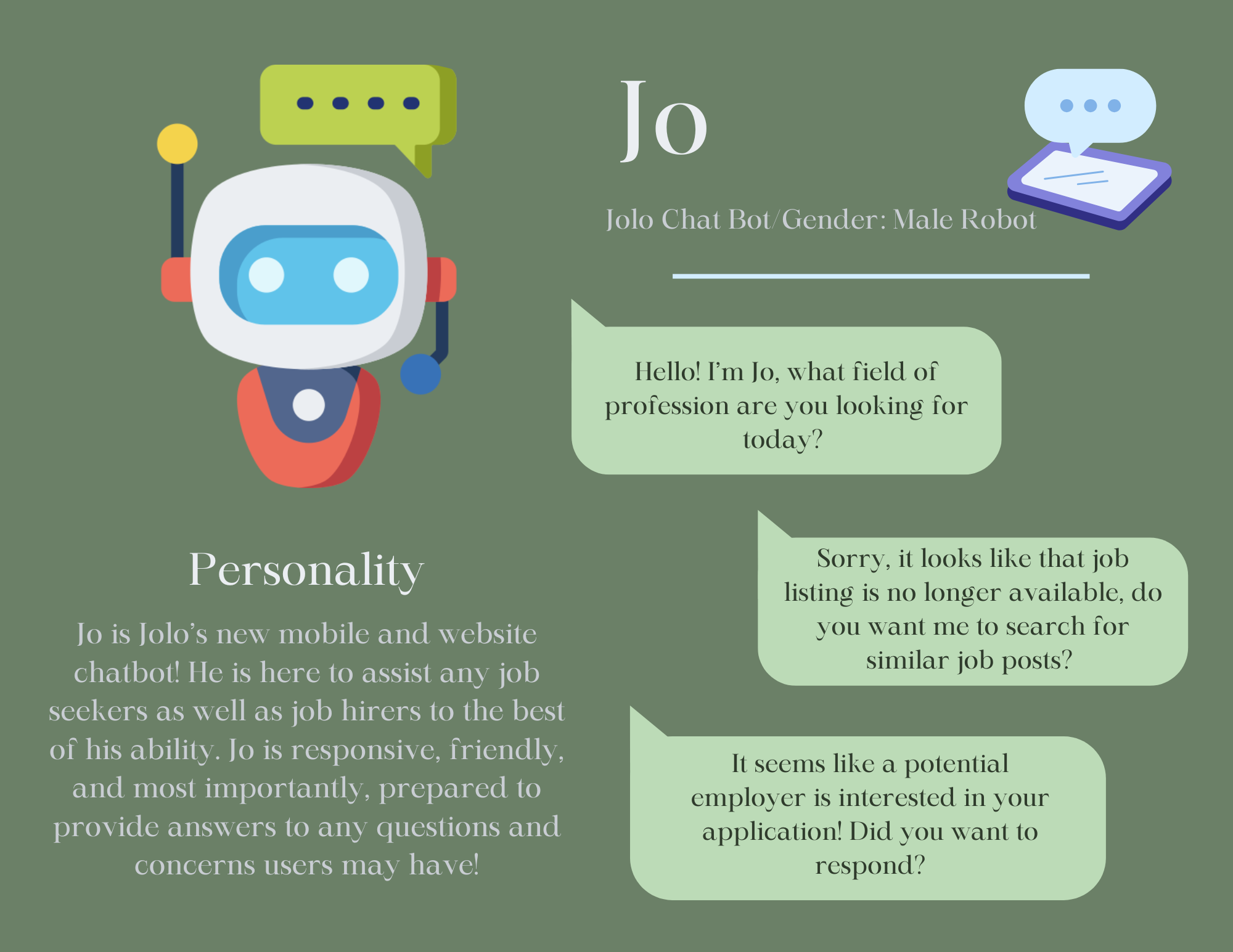
JOLO AI
UX Researcher
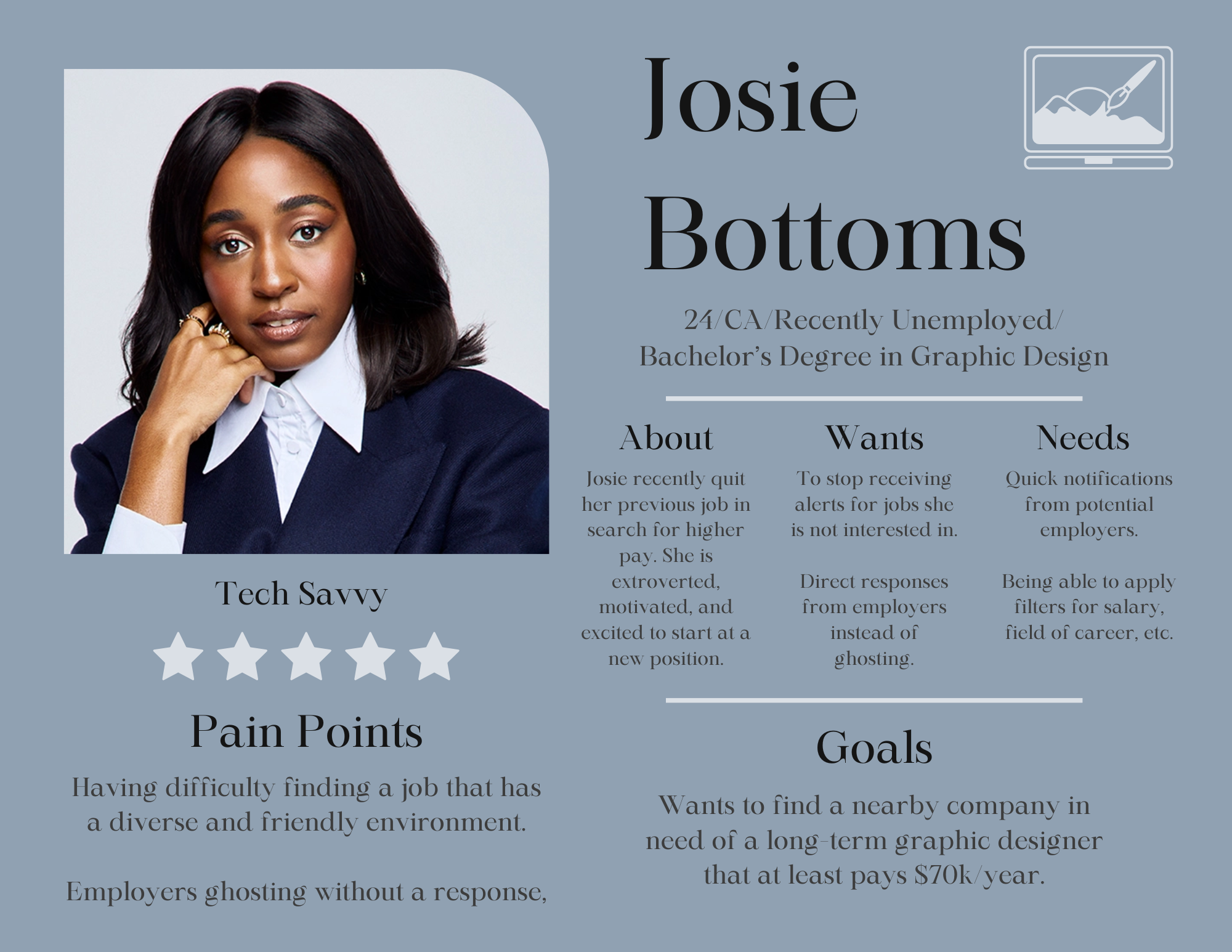
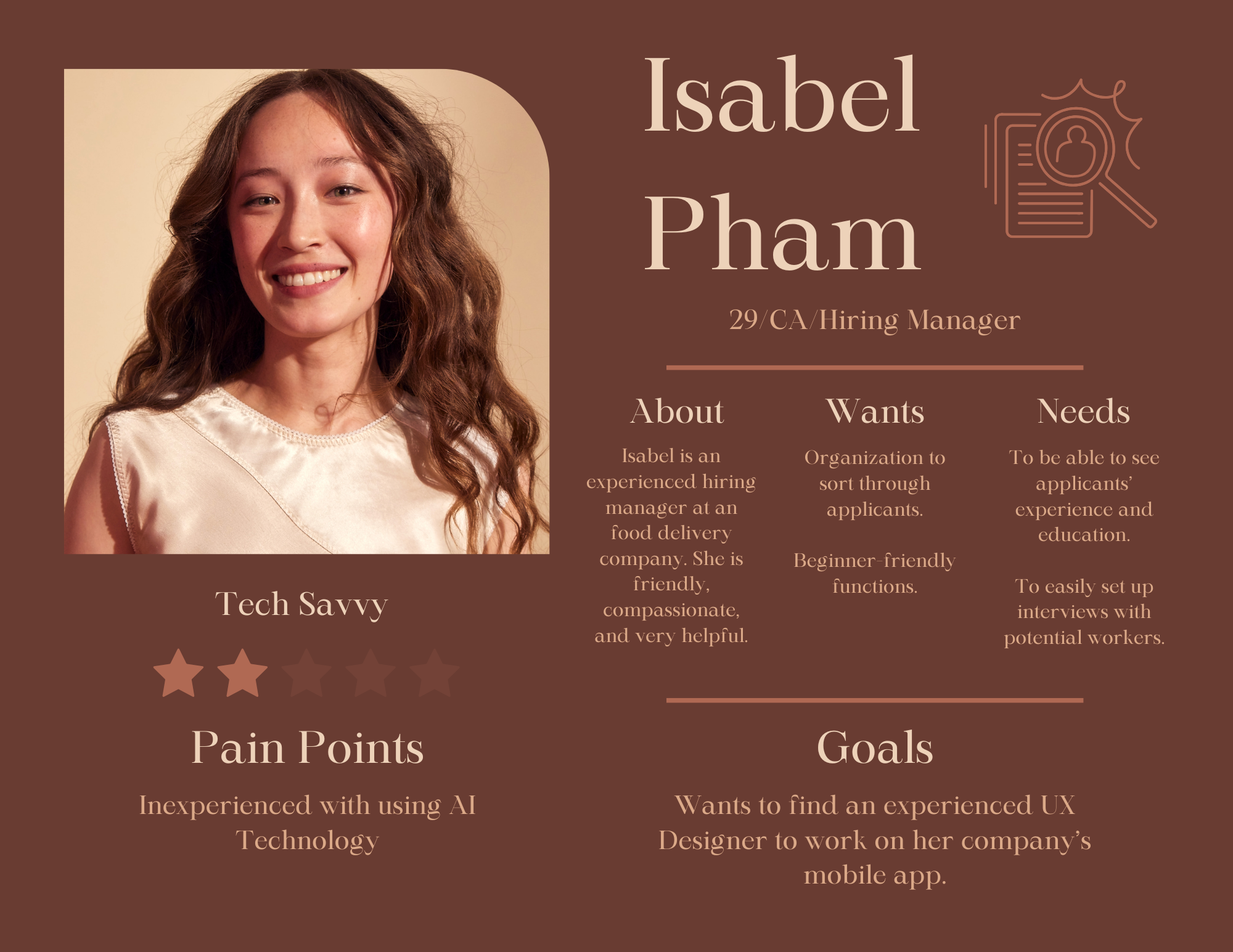
This project focused on understanding user needs and challenges in the job search process, with a focus on JOLO AI, an AI-powered platform that matches candidates to jobs based on skills, preferences, and fit while reducing bias through features like anonymized profiles. My goal was to gather insights on user demographics, job search behaviors, and expectations to help improve the overall experience.
To conduct the research, a survey was distributed and received 22 responses with a 100 percent completion rate. The survey included multiple choice, checkbox, and one open-ended question, covering demographics, job search methods, satisfaction with job notifications, and common challenges. The data was analyzed to identify patterns in user behavior and key pain points.
The results showed that most users relied on job listing websites and networking, with many already employed and familiar with job platforms. Common challenges included lack of relevant opportunities, competition, and low response rates from employers. Users prioritized salary and wanted features like better filtering, personalized recommendations, and tools to reduce job ghosting. These insights I found highlighted areas where JOLO AI can improve usability and better support job seekers.
Research Methods
View Full ResultsToyota Center
UX Researcher
This study evaluated the usability of the Houston Toyota Center website for users attending concerts and live events. The goal was to assess navigation, design clarity, and how easily users could complete key tasks like signing up, finding events, and buying tickets.
Usability testing was conducted with three participants who matched the target audience. Each completed five tasks, including account creation, event search, ticket purchasing, seating chart lookup, and contacting support. Sessions were observed in person or via screen share, with task times recorded and user feedback collected to identify issues.
Most tasks were completed quickly, especially finding events, buying tickets, and contact information. However, users were confused by the “Login” vs “Insider Signup” buttons and had difficulty locating seating charts. Overall, I found that the site was usable but needs clearer labeling and improved navigation.
Research Methods
View Case Study