LiveDive
LiveDive is a centralized hub for live music fans to stay connected and informed. The app gives real-time concert updates, lets users explore reviews and experiences shared by others, and creates a space where fans can stream and share moments from live shows. Designed to capture the energy of concerts while keeping information accessible, LiveDive brings the excitement of live music directly to your phone in one seamless platform.
everything i want from a concert is scattered across five different apps
As someone who goes to concerts pretty often, I kept running into the same frustration. To find everything I wanted to know about a show, I was bouncing between Twitter for last-minute changes, Google for venue info, Setlist.fm for what songs might be played, and whatever else just to piece it all together. It was tedious, and half the time the info was outdated anyway.
On top of that, I had this habit of rating every concert I attended in my notes app. Score out of five, what I liked, what fell flat, setlist, energy, crowd... basically all of it. Doing that for a while made me realize how useful it would be to combine both things into one place: a centralized info hub and a place to rate and review shows, with a real community built around it.
That's where LiveDive came from, as I was inspired by how Letterboxd handles film reviews and community sharing, I wanted to build something similar for live music. I also added a live streaming feature so people could get real-time updates during a show, whether they're in the crowd or watching from home. Let people see when an artist is performing now, or if something unexpected just happened on stage.
looking at what already exists and who's using it
Before jumping into wireframes, I spent time looking at the existing tools people use for concerts. Ticketmaster, Bandsintown, and Setlist.fm all do pieces of what I needed, but none had everything in one place. I also looked at Letterboxd and Yelp to pull inspiration for how community-driven reviews work. The pattern I kept seeing was that every app solved one part of the problem really well, and users were expected to patch together the rest themselves.
user persona
I built out a persona to keep the design grounded in a real person's needs rather than an abstract audience.
Part-time barista — $15/hr
Los Angeles, CA
- Easy access to setlists, runtimes, and ticket prices
- A way to share concert details with friends
- Honest takes on whether a show is actually worth it
- All concert info in one place, not scattered across apps
- Quick, accurate updates for last-minute changes
- Authentic feedback from real music lovers, not sponsored content
- No car and needs time to plan transportation
- Tight budget, can't splurge without knowing it's worth it
- Reviews feel scattered or unreliable
- Often misses bag rules, setlist changes, or venue updates
- Social media, peer reviews, nearby artists performing, affordable shows
- Merch prices, venue food costs, bag regulations, crowd behavior, general dress code
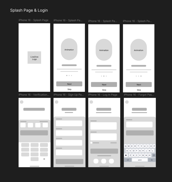
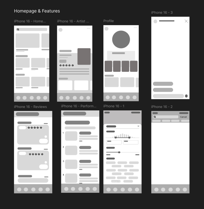
lo-fi wireframes: getting the structure right first
I started with lo-fi wireframes to map out the core flows: onboarding, concert discovery, event detail pages, the review system, and the live streaming feed. At this stage I wasn't thinking about how things looked. I just needed to know whether the structure made sense. I went through two rounds of lo-fi before feeling ready to move into branding and high-fidelity.
colors and typography: making it feel like a live show
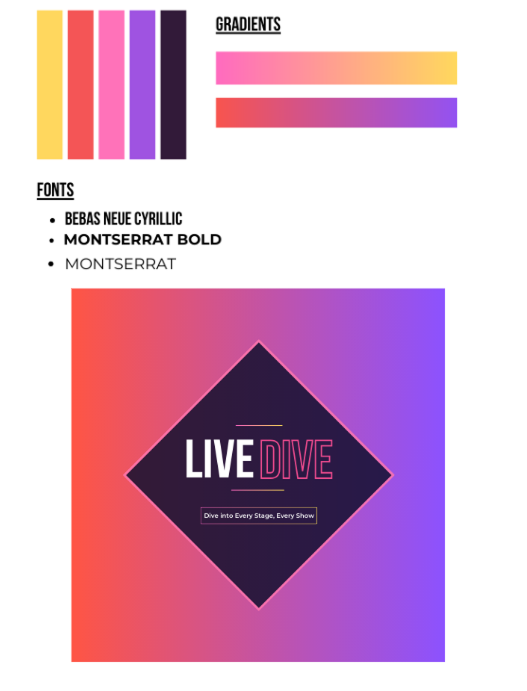
When picking colors, I wanted the palette to feel as alive as a live show but still credible enough that users would actually trust its reviews. A boring, corporate-looking app for something as energetic as concerts felt completely wrong to me. But I also didn't want it to look unreliable. That tension is what landed me on yellow, orange, pink, purple, and dark purple.
Yellow and orange bring the explosive energy of a show opener. Pink softens it and makes things feel more approachable and inclusive. Purple carries that artistic, venue-at-night feeling. Dark purple is where the serious stuff lives: ratings, in-depth reviews, anything that needs to feel grounded and trustworthy. The gradient from light to dark also mirrors the arc of a concert night. Start buzzing with excitement, wind down into the dark after a great performance.
For typography, I went with Bebas Neue Cyrillic as the display font. It's bold and modern without feeling corporate, which was exactly the balance I was going for. Montserrat Bold and Regular round it out as secondary fonts, keeping things legible and contemporary. The logo ties it together: "LIVE" in solid weight, "DIVE" outlined to evoke stage lighting, set inside a diamond that nods to a play button. The slogan, "Dive Into Every Stage, Every Show," plays on the app name while telling users exactly what it delivers.
high-fidelity prototype: the full experience
With the wireframes validated and the brand locked in, I moved into high-fidelity in Figma. The final prototype covers onboarding, the main discovery feed, event detail pages, the review system, and the live streaming experience. Every screen was designed with Rowan in mind: fast to navigate, honest in its content, and clear about what's happening where.
- Friend system where users can follow others and like each other's reviews, making it feel like a real community rather than just a database
- Live streaming so fans can share real-time moments from a show and others can tune in remotely or catch live updates during a performance
- Favorites list for concerts you've attended or want to track, making it easy to return to shows you care about
- Beli-style comparison ranking where users build a personal ranked list of concerts they've been to, sortable by genre, making concert opinions actually useful and comparable
- Venue and nearby recommendations for parking, food, and merch spots around the concert, so users aren't scrambling the day of the show
- User-based verification to keep reviews authentic and legitimate, building trust in the feedback system from the ground up
what this project actually taught me
Designing something I personally needed changed how I approached the whole process. Here's what I took away:
- Being your own first user is useful, but it's not enough. I knew my problem really well, which made the research phase feel natural. But building Rowan's persona helped me zoom out from my own experience and design for someone with different constraints, like no car and a tighter budget, which pushed me to surface information more upfront and make features more accessible.
- Competitive analysis isn't just checking boxes. Looking at Ticketmaster, Bandsintown, Letterboxd, and others showed me exactly where the gap was. Seeing what each app did well and where users had to patch things together themselves validated the concept way more than anything I could have come up with on my own.
- Branding communicates before a user reads a single word. Picking the color palette and typography for LiveDive made me realize how much the visual identity does upfront. The gradient, the font choice, the logo shape: all of it tells a story before the app even loads.
- Scope management is a real skill. A concert app could go in a hundred directions. Deciding what made it into the prototype and what got cut required real prioritization. Not because the features weren't worth including, but because trying to do everything would have made nothing work well.
- Solo projects are a different kind of discipline. Working alone meant every decision was mine to make and mine to justify. There was no collaborator to check assumptions with, which forced me to be more deliberate and more honest with myself about whether something was actually serving the user or just something I liked.
designing from a problem i actually lived
LiveDive started as a personal frustration turned into a design prompt. Going through the full process solo, from research to branding to a high-fidelity prototype, gave me a much clearer sense of what I can actually build when I genuinely care about the problem. It's a different kind of investment than working from a brief.
The hardest part wasn't the design itself. It was deciding what not to include. Constraining the scope while keeping the core experience tight was a real exercise in prioritization, and I think the final prototype is better because of those calls. If I were to keep going with this, the next step would be usability testing with real concert-goers to see where the experience holds up and where I was too close to the problem to see the gaps.