FinThrive
FinThrive is a healthcare revenue management platform serving hospitals, health systems, and physician practices across the United States. During my six-month internship, I joined the product design team and contributed high-fidelity designs to a portfolio of over 50 products that help healthcare organizations manage revenue, billing, and financial operations.
The work spanned multiple product teams and required navigating complex, data-dense workflows for non-technical healthcare finance users.
how can i help simplify complex healthcare finance software?
FinThrive's platform supports revenue cycle teams like billing specialists, coders, and account managers as they work through complex workflows involving large amounts of data, strict compliance rules, and very little room for error. The challenge is not just making something visually clean, but designing tools that actually help people stay accurate and efficient under pressure while dealing with dense information and tight deadlines.
Supported Design Requests Across Teams
I worked through design tickets and requests from different teams, which meant I supported multiple products at once and had to quickly switch contexts while making sure each request fit its specific goals and constraints.
Worked Within and Improving the Design System
I learned how the existing design system worked and built on top of it instead of starting from scratch, while making sure everything stayed aligned and usable. I also kept a fresh perspective by identifying gaps and suggesting practical improvements to make complex workflows easier to understand.
Did the "Boring but Important" Work
I handled the foundational work like moving, updating, and connecting components in Figma that had not been fully maintained since the company was acquired in 2021. I also worked on tasks like creating dark mode mockups and helping keep components consistent and up to date across different parts of the products.
how i approached the work as an intern
Working across multiple product teams simultaneously meant I had to be intentional about how I ramped up, prioritized, and communicated. A few patterns shaped how I worked throughout the internship:
Learn the domain before touching the design.
Healthcare finance has its own vocabulary: revenue cycle, denial management, remittance, payer contracts. I spent the first few weeks making sure I understood what the users actually did before I formed any opinions about the design. That investment paid off every time I had to explain a decision in a stakeholder review.
Incorporate feedback at every stage, not just at review.
FinThrive's process was structured around regular stakeholder checkpoints, but I found the most useful feedback came from informal conversations with engineers and PMs in between. Adjusting constantly meant my work was less likely to require major changes at the end of a cycle.
Own the feature, not just the screen.
The expectation was to own a feature from concept to iteration, not just deliver screens. That meant thinking through edge cases, flagging gaps, and staying involved after handoff. It changed how I thought about what "done" actually means in a design context.
Research and design as one continuous loop.
I produced insights in parallel with design work, not as a separate phase before it. That made the designs more grounded and made the research more actionable: each informed the other in real time rather than in sequence.
key designs that actually made a change
I contributed to several key features by starting with low-fidelity wireframes and gradually refining them into higher-fidelity designs based on feedback from teammates and stakeholders. This iterative process helped ensure that ideas were tested early, aligned with product goals, and improved through multiple rounds of critique before moving into more polished solutions.
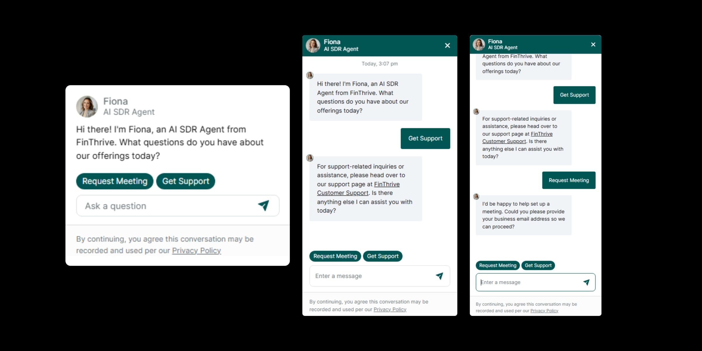

Designing a chatbot AI for FinThrive started with low-fidelity wireframes focused on structure rather than visuals. I iterated on conversation layouts and refined how users initiate interactions, aligning the final interface with established industry-standard chatbot patterns to reduce cognitive load.
- Quick-start buttons for the most frequent user needs, reducing friction for first-time and returning users in high-pressure operational environments where speed matters
- Thread-centric layout with clear input field placement and visible conversation history, ensuring users never need to learn a new interaction model just to get help
- Dynamic chat expansion where the window grows vertically as messages accumulate, improving readability during longer sessions and reducing excessive scrolling in a constrained viewport
I initially explored a free-form input-only layout, but early validation showed users hesitated when they did not know what to ask first, which is why quick-start buttons became the anchor of the experience. Dynamic vertical expansion was chosen over a fixed-height scrolling window because longer support sessions felt cramped during prototype walkthroughs, and growing the thread in place kept context visible without forcing users back up the conversation.
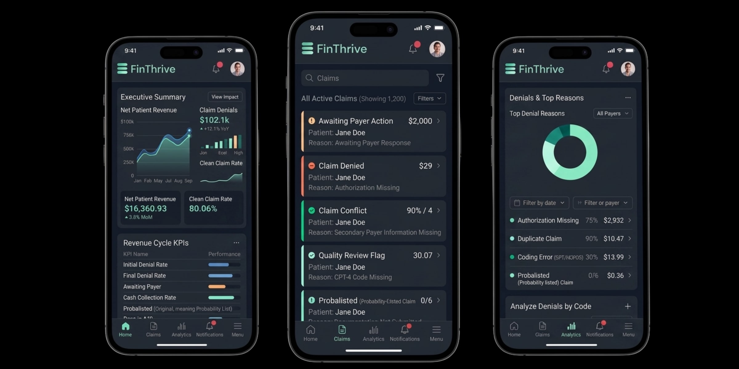
I created a full dark mode prototype for the mobile experience aimed at improving accessibility and reducing eye strain for users who often work long hours in the platform. The goal was not to simply invert colors, but to thoughtfully redesign the interface for low-light usability while preserving existing brand and interaction patterns.
- Mapped design system tokens (colors, typography, elevation, and states) to identify what needed adaptation rather than replacement, ensuring dark mode felt like a natural product extension rather than a separate experience
- Adjusted contrast ratios to accessibility standards using deeper neutral backgrounds and calibrated surface elevations to preserve visual separation without harsh blacks or heavy shadows
- Softened border and divider contrasts, increased text contrast, and carefully handled disabled and secondary states to ensure sustained readability in prolonged low-light use
I started by token-mapping the existing light system rather than recoloring components from scratch, since a 1:1 inversion approach broke several elevation cues during my first contrast tests. Disabled states needed the most careful work because the obvious solution of lowering text opacity further crossed AA thresholds, so I shifted to a desaturated surface treatment that keeps states distinguishable without sacrificing accessibility.
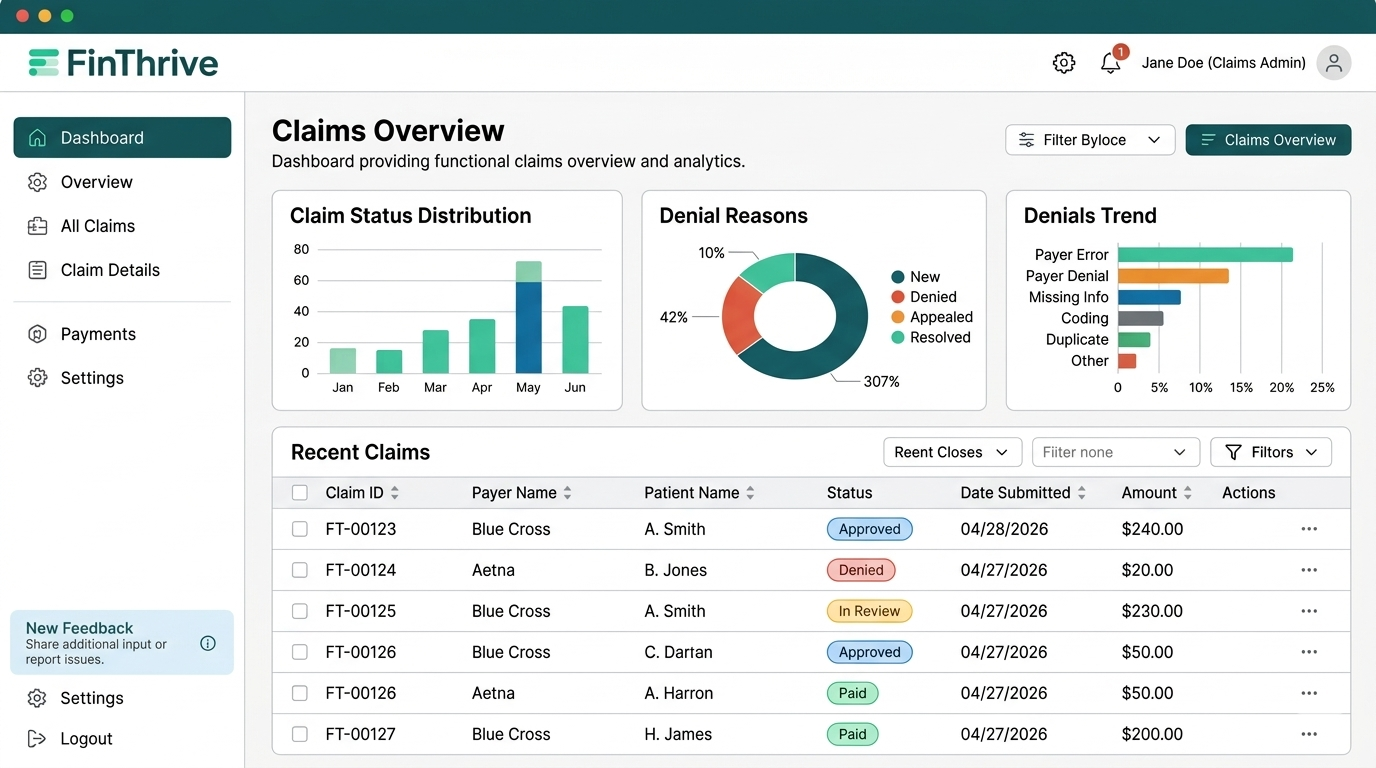
I collaborated closely with another designer from early ideation through to a fully built prototype for the claims dashboard. We started in a shared FigJam board, mapping user needs, pain points, and key workflows before translating them into a structured layout focused on scannability, clear hierarchy, and fast access to high-value information.
- Defined core user flows and refined how users navigate filters, drill into claims, and compare data points in a way that felt intuitive and efficient, grounded in real user behavior from the start
- Iterated through multiple feedback cycles with design and software engineering teams, surfacing Power BI constraints that required adjusting interaction patterns and rethinking filter and drill-down states
- Balanced ideal user experience with technical feasibility across each feedback round, producing a final prototype that was both practical to build and aligned with real user needs identified at the beginning
I tested a sidebar-filter pattern alongside the persistent top-bar filters we eventually shipped, and the top-bar won because users repeatedly lost their scroll position when the filter panel sat next to the chart they were trying to compare against. The summary cards at the top came out of a hierarchy debate where we considered burying KPIs inside the table itself, but research showed users almost always start with the daily aggregate before drilling into specific rows.
six months of shipping real work
"Kathlyn brought a level of initiative and design quality that stood out immediately. She consistently delivered thoughtful, well-considered work and was a real contributor to the team."
Matt Rife, Product Design Managerwhat working in enterprise saas actually taught me
Working in a large SaaS organization with established design systems, multiple product teams, and real users in high-stakes jobs was a fundamentally different experience than academic or personal projects. A few things stood out:
Constraints are the design. In enterprise software, the constraints (technical, compliance, workflow-based) are not obstacles to the design. They are the design. The best solutions I came up with came from deeply understanding a constraint, not from working around it.
Stakeholder communication is a design skill. Getting feedback incorporated and getting buy-in on a design direction are two different things. Learning how to present work in a way that moves a conversation forward, not just displays it, was as important as any visual decision I made.
Six months is enough to see the whole cycle. I was able to follow features from initial concept through iteration and into handoff. That end-to-end view of the process, including all the places where real projects diverge from the ideal, is something you only get from extended time at a real company.
the best design work happens inside systems you didn't build
FinThrive showed me what it means to do design work inside a system that already exists, with legacy patterns, established component libraries, existing users, and teams who have been shipping this product for years. That is most of what design work actually is. Learning to improve something without breaking what already works is a harder and more valuable skill than starting from scratch.
One of the most meaningful parts of the experience was visiting the Dallas headquarters for a week. Being on-site gave me the chance to sit with the team, attend real meetings, and understand how decisions are actually made inside a company. I got to learn directly from experienced designers and product leaders, which shaped how I think about the work in ways a remote internship simply could not. I came to understand FinThrive's company values and mission in healthcare fintech not just from documents, but from conversations with the people living it every day.
That week also gave me the opportunity to network across departments and build relationships I would not have made remotely. The internship was extended because the work was useful. That is the best signal I could ask for, and it is what I will carry into every project going forward.
Designing for enterprise SaaS in healthcare finance also reshaped how I think about information density. I learned that dense interfaces are not "bad"; they are usually a sign that someone uses the screen for hours and needs everything within glance distance. The work that mattered most was figuring out how to set hierarchy inside high-stakes views where a misread number could affect a real claim or a real operations decision. That is the kind of work I want to keep building: tools where speed, density, and clarity have to coexist for people whose work depends on the screen in front of them.